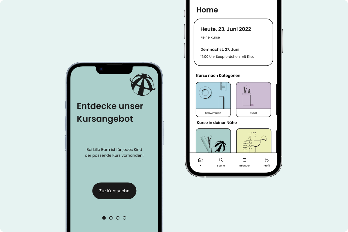
The two founders of Lille Barn gave us the task of creating a digital prototype of their app idea. The aim of Lille Barn is to digitise the offer of early childhood education courses and to provide a straightforward process for parents to search and book courses. The app also offers course providers the possibility to easily create and edit their own courses and monitor their performance. As a team, we created a unique design language and built two high-fidelity prototypes.
Tools: Figma, miro, Notion
Time: March 2022 - July 2022
Semester: 6
The two founders are parents themselves and found it a challenge to find and book courses for the
early
childhood development of their children. In addition, they experienced that a cancellation of a
course date, e.g. due to a sick child, is often not possible spontaneously.
The course providers, on the other hand, complain that there is no central platform through
which it is possible to manage and monitor their course offerings.
Lille Barn wants to solve these problems by offering a digital solution.
At the beginning of the project we decided to work according to the Design Thinking Process. Since the two founders provided us with information in advance, such as details about the user groups, we started the project with some background knowledge. This allowed us to build an understanding of the users' needs.
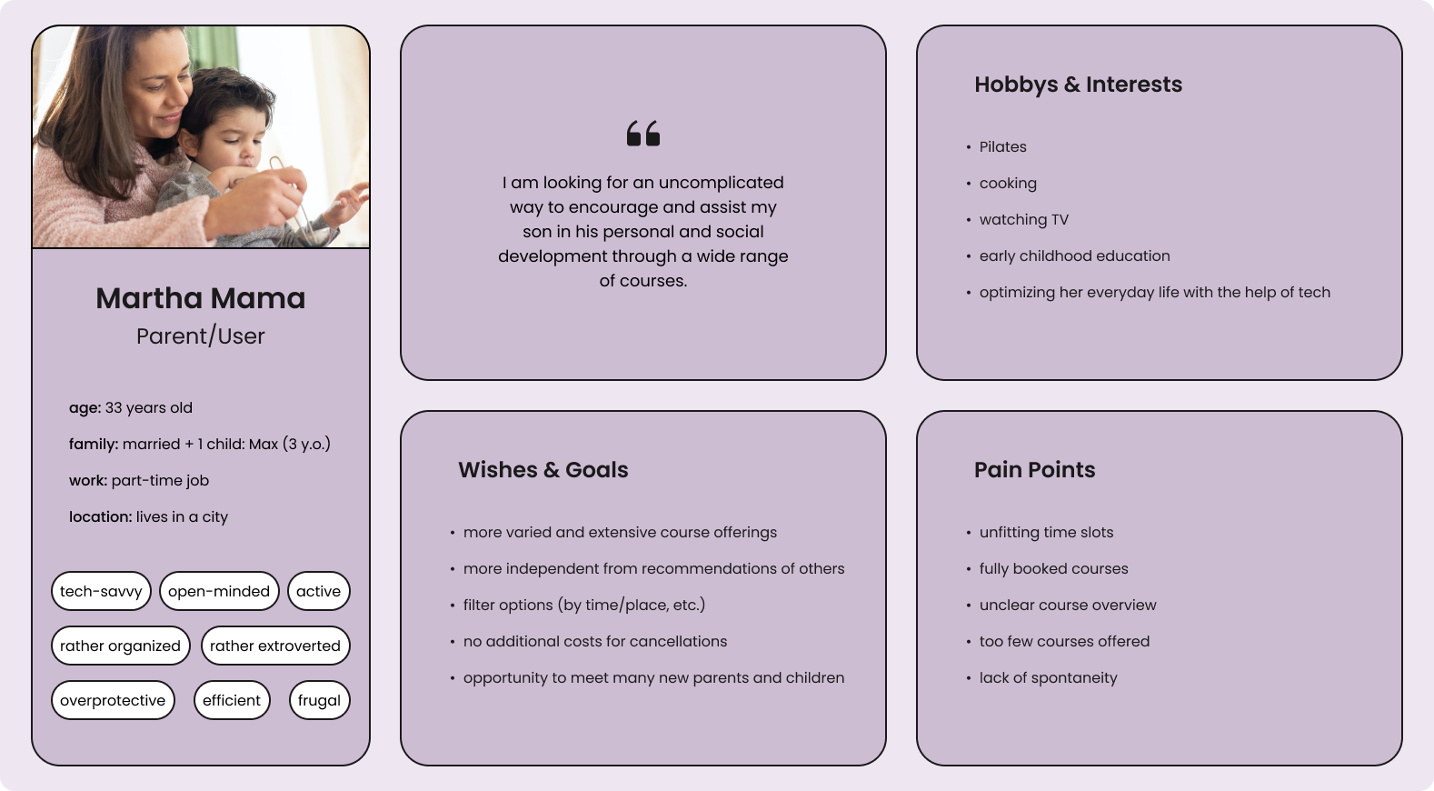
Parents seeking early childhood activities and classes for their children represent the first user group of Lille Barn. Therefore, we created the profile of Martha Mama as a persona, who is looking for a simple solution to plan her child's activities.
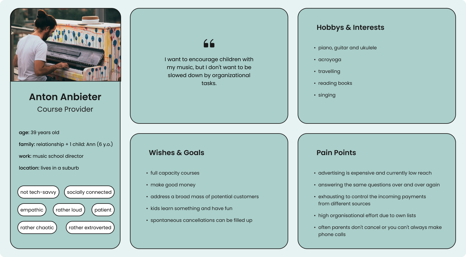
The second target group includes providers of courses and activities for children up to the age of six. This user group is represented by Anton Anbieter, who is the director of a music school and offers courses for children.
The user flows of the two apps had already been created by the startup Lille Barn, which we reviewed and optimized. These represented our basic frameworks when creating the prototypes. Below is a highly simplified view of the structure for the parents' (or user) and the course providers' app.


Before we went fully digital, we sketched out the screens based on the two user flows. This allowed us to implement our ideas very quickly and discuss together as a team whether the structure of the apps seemed logical and coherent. We then used Figma to digitize our sketches.
This digital version also made it possible for us to conduct a few tests with parents. The feedback enabled us to optimize the app at a very early stage.
To settle on a design language, we created a mood board. We wanted to use rich colors, a bold font, black-toned elements and illustrations. In addition, we determined that all dimensions should be based on a multiple of the number 8. We decided on Poppins as our typography, as this font fits our bold style very well.
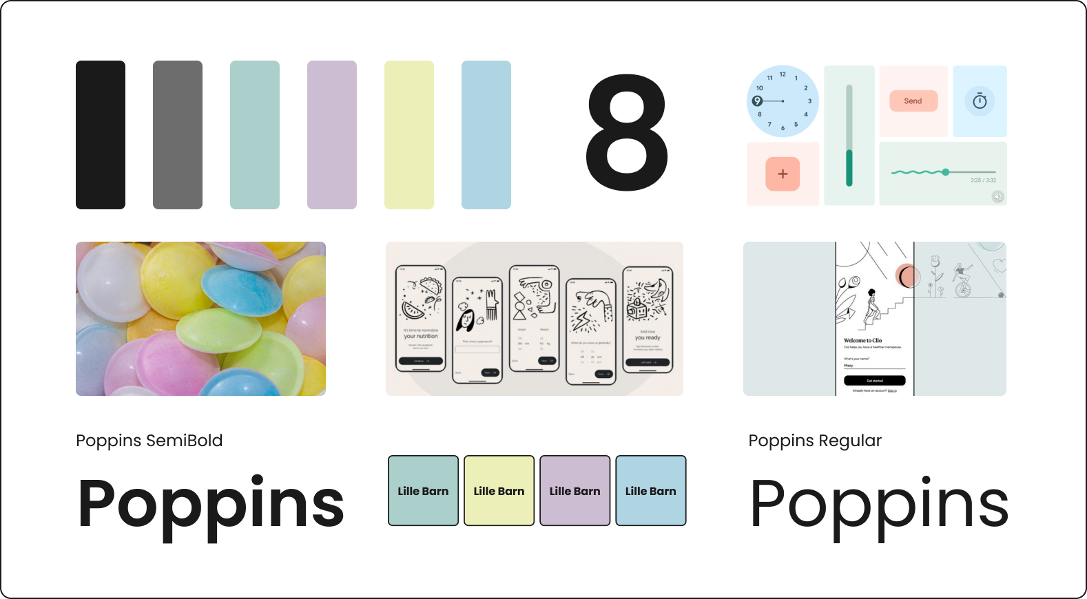
When designing our screens, we realized that the specified shades of green, blue, yellow and violet were not enough for us, so we expanded our selection to include a paler shade in each case. We developed the following color palette:

For us it was important that our design should be for adults, as they are the user group of both apps, but still thematically relate to children. That's why we used illustrations for the different course categories and in some screens, for example, to make the registration process seem less monotonous. The illustrations were created by Isabella.

When the app is first launched, users can swipe through four intro screens that explain the benefits of Lille Barn. Three options are available: login if an account already exists, registration when using the app for the first time, and a course search.
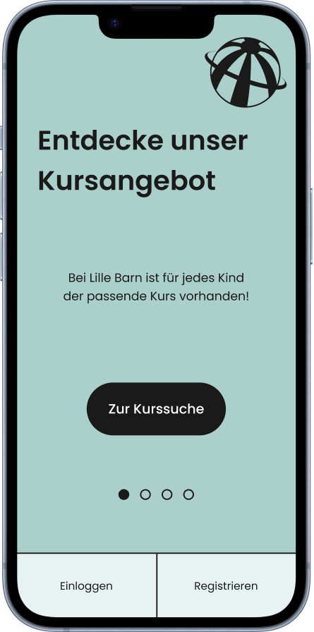
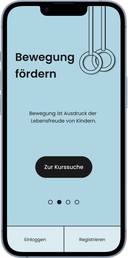
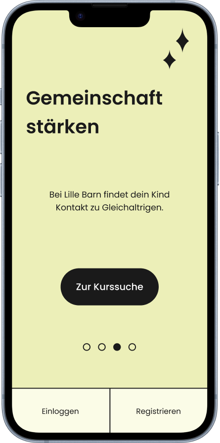
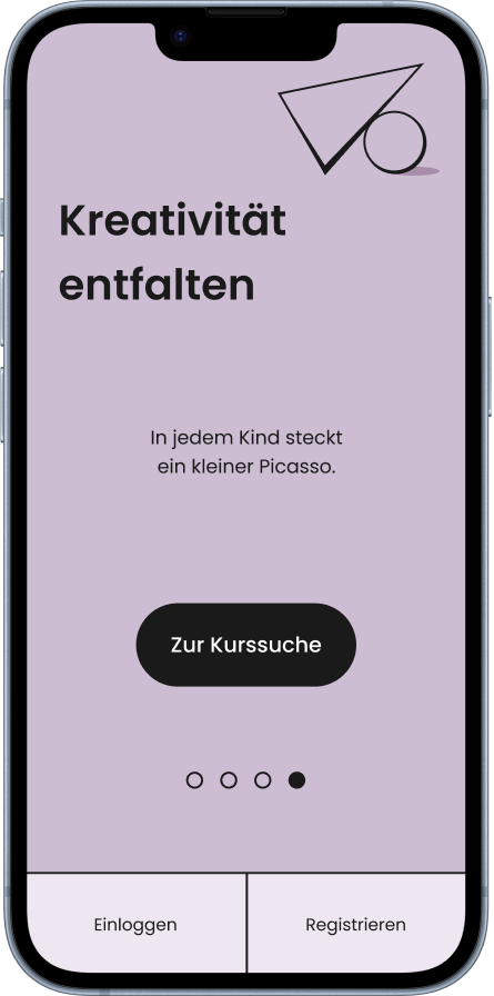
By selecting the course search, users can learn about course offerings before registering. It was important for us to get the user experience right here: We absolutely wanted to avoid users having to create an account, only to find out afterwards that the course offering at their own location is either not available or does not meet their expectations.
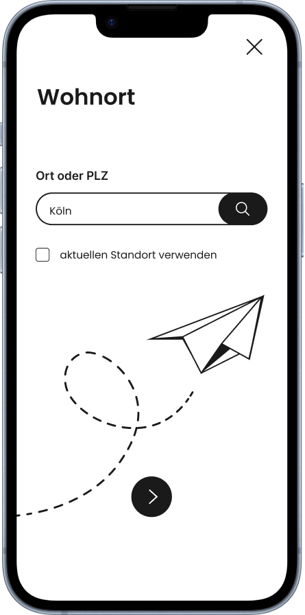
Location
First, users must specify their place of residence.
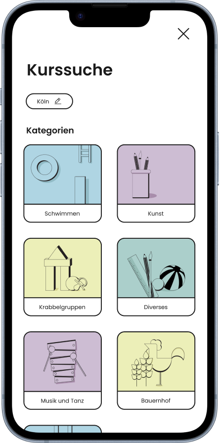
Categories
Users can then select a course category to refine their search.
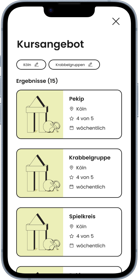
Courses
The search results now show all offers that are currently available.
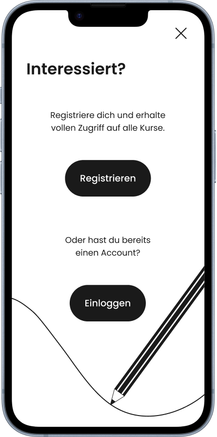
Register
If the user wants more information about the course, they will be
prompted to either log in or register.
The registration process takes place in small chunks: After entering name, place of residence, e-mail address and password in one screen each, the user is asked to provide information about his or her child.
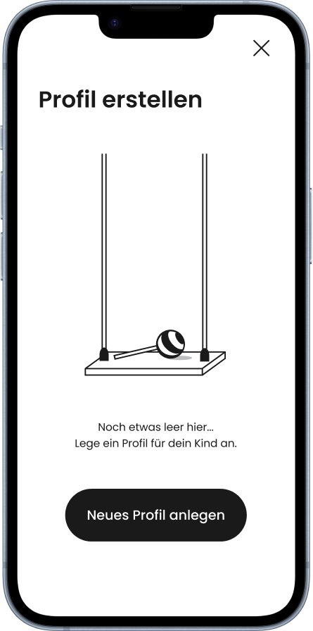
Profile
If no child has been registered yet, this screen will appear. Later, an
overview of the children's profiles appears here and more can be added.
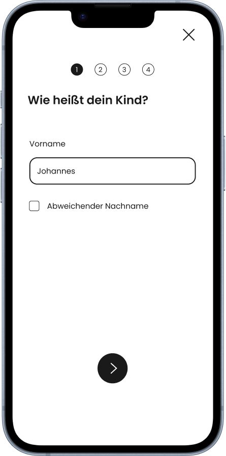
Name
The user specifies the name of the child. There is also an option to specify
a different last name.
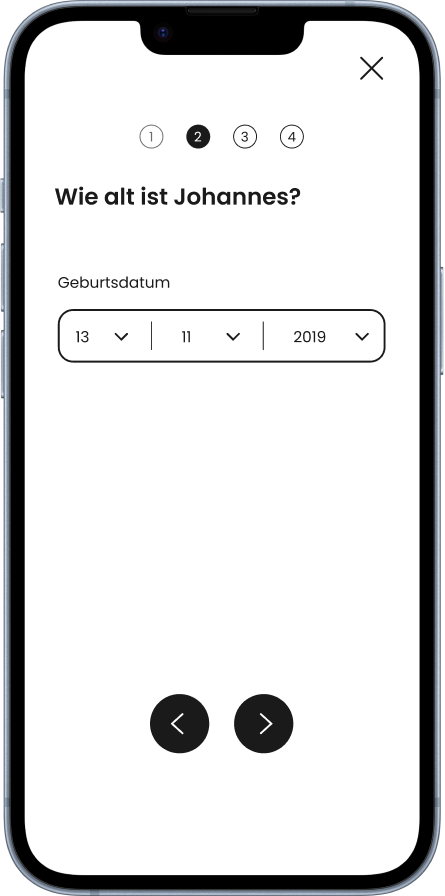
Age
After that, the birthday must be specified. Later, this information can be
used to refine the search for courses.
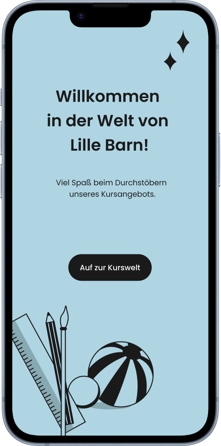
Registration complete
After the payment details have been entered, the
registration is complete and the user can access the home screen.
On the home screen, the user has access to the main functions of the app: searching and booking courses, managing booked courses, customizing profile details, and later check-in to courses on site.
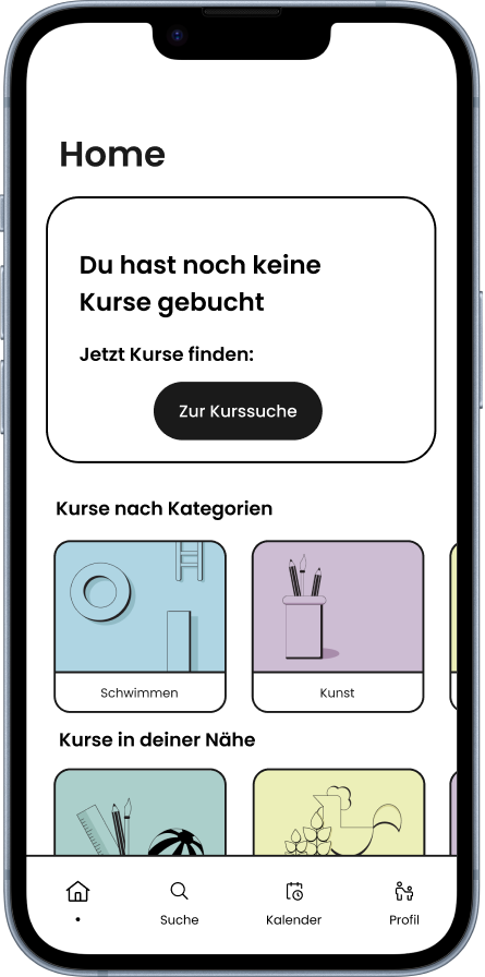
Homescreen
The home screen is structured like a dashboard. Further options can be
accessed via the navigation bar at the bottom.
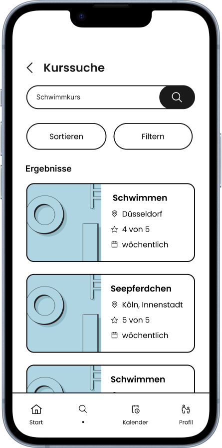
Search results
Similar to the course search from the introscreens, the logged-in
user can now also select filter options and sort the results.
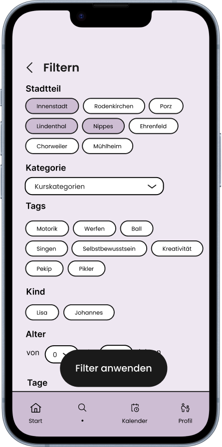
Filter options
The filter options are numerous: it is possible to filter by city
districts, a specific course category or even by tags assigned by the course providers.
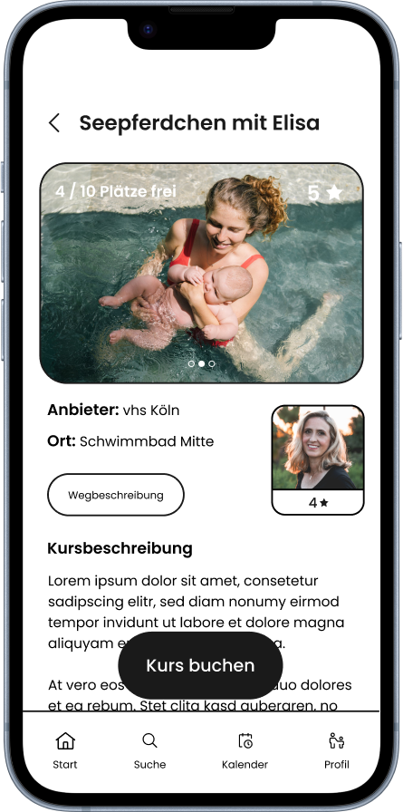
Course details
Within the detailed view you can find more information about the
course before booking: pictures, ratings, descriptions and also information about the
course provider.
The course booking process is again divided into individual chunks. It was important to us that the process is quick and straightforward to ensure an optimal user experience.
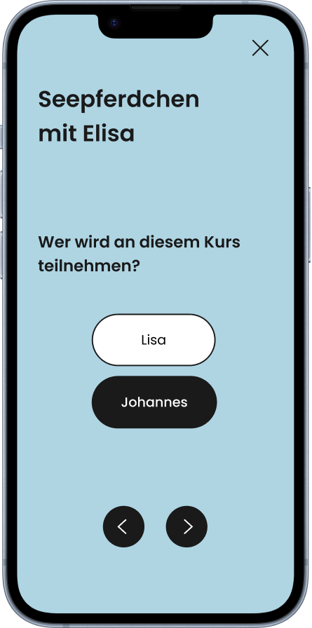
Choose child
If there is more than one profile for a child, the system first asks
for which child the booking should be made.
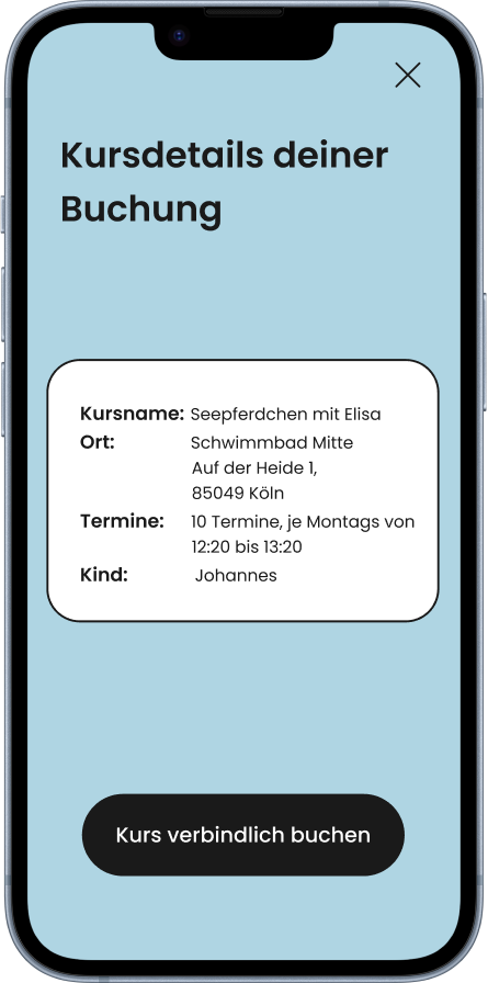
Confirmation
All the information is presented in summary before the
actual booking takes place.
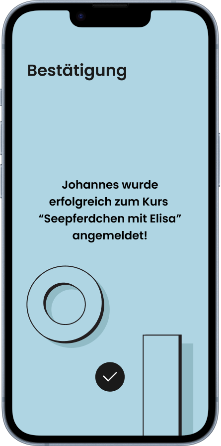
Feedback
After the course has been booked, the user receives feedback from the
system.
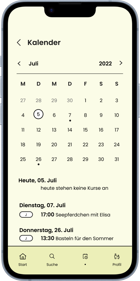
Calendar
Booked courses can be viewed and managed via the calendar.
The app for course providers has the same design as the app for parents. However, the app differs in terms of functionality, as the focus is on creating, managing and monitoring the courses offered.
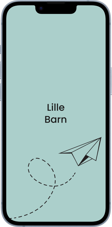
Boot-up screen
This screen appears when you start the app. The paper airplane is
animated.
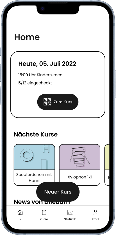
Dashboard
The dashboard informs the user about upcoming courses. Additional
features such as monitoring can also be called up via the navigation bar. The creation
of new courses is also possible with just one button click.
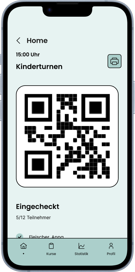
Check-in
When a course starts, the course provider can call up a QR-code that
parents can scan using their app. This gives the course provider an overview of the
participants.
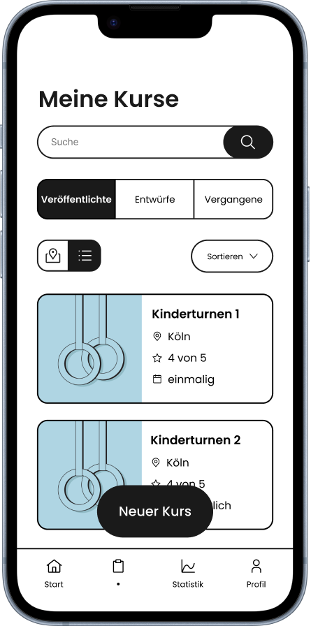
Course Management
Course providers can view and edit courses that have already
been created or place drafts online. New courses can also be created.
We divided the process of creating a new course into small chunks because we didn't want to overwhelm the user when entering information. It takes seven steps in total: In addition to selecting the category, the course description can be specified, different tags can be selected, the time and date of the course can be entered and pictures can be uploaded.
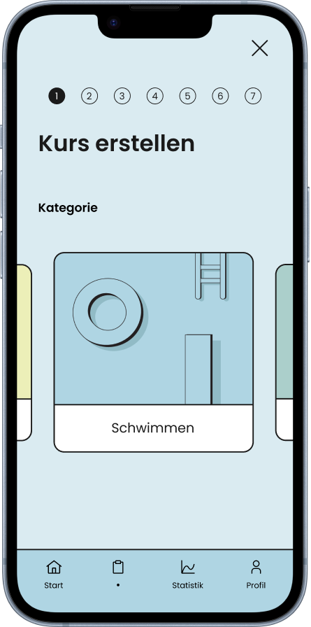
Select category
Users can swipe through the different categories. This also
changes the background color of the app to fit the category thematically.

Set tags
Course providers can set the tags here, which parents can use to filter
when searching for courses.
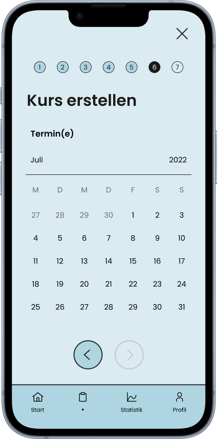
Set date
Here the user can select individual dates on which the course should take
place. This can be further specified, for example whether this is a regular appointment.
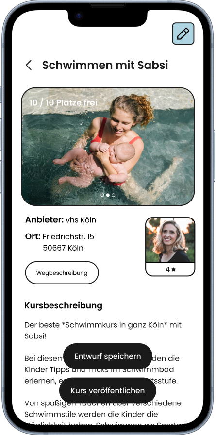
Course Management
The course is not yet published immediately afterwards. In the
course preview, the course can be viewed as it appears to parents. Besides, the user can
also first create a draft to be saved for later.
The app also gives course providers the option to monitor the performance and returns of their courses. The user can view various relevant statistics.
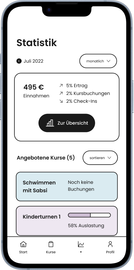
Monitoring dashboard
All relevant data on the overall performance of all courses
can be viewed here.
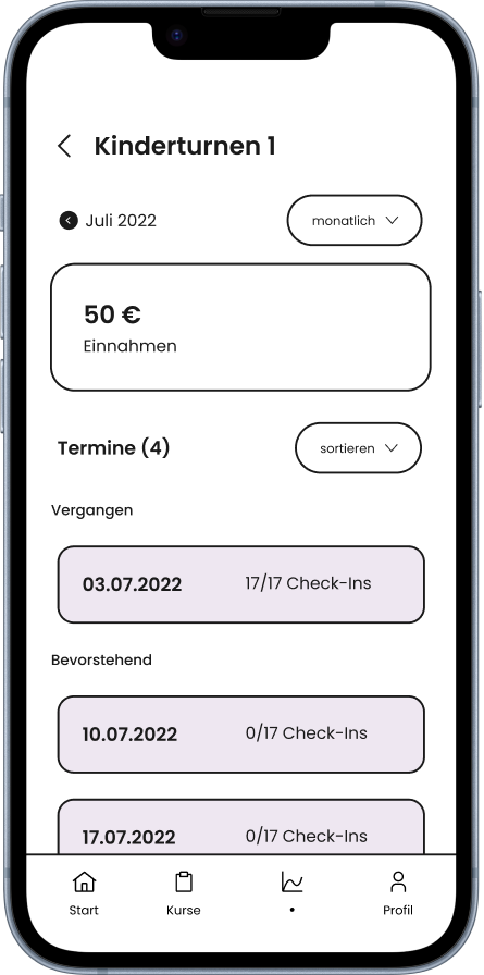
Detail view
If a specific course on the dashboard is selected, the user will get
all the
information for that course only.
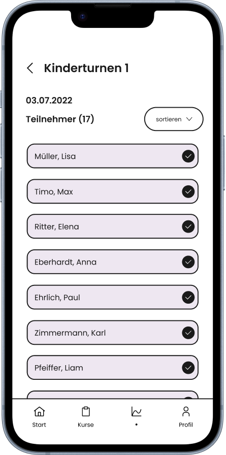
Date view
For a specific appointment, the user can also display the participant
list and view the children who have checked in.
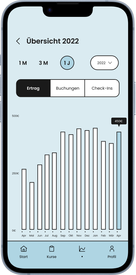
Diagram
If the course provider selects the overview button on the dashboard, he
receives a diagram display in which he can filter for various metrics, such as revenue
or check-ins.
We were able to test the parent app several times throughout the process because we had easy
access to mothers and fathers. Since the structure of the app follows familiar patterns and
contains few new features, the feedback was consistently positive and we only had to adjust
minor details.
For the course providers' app, we recruited a lady from the city's adult education center. The
testing helped us a lot in optimizing the app, as we could not always perfectly empathize with
the role of the course provider ourselves. In addition to small changes regarding the navigation
within the app, we also received important advice on the relevant metrics in the monitoring
section of the app. We also changed the name "Monitoring" to "Statistics" as this was easier to
understand.
It was a great experience to use our skills to implement a real business idea. In this project,
the focus was on the design and implementation of the digital prototypes, as we had received
information in advance from the founders. Even though this meant that there was no intensive
research phase, our goal was to test the idea and the app flows at every good opportunity.
When working out the visual language of the apps, we decided to take a unique direction. We felt
that every app looks the same these days - we didn't want to create a product that looked
equally monton and uniform.
The teamwork was exceptional. In the beginning, we split the two app flows between us: Philippa
and I focused on the parent app, while Isabella and Sarah mainly took over the course provider
side. This also allowed us to give each other valuable feedback on our screen designs.