moqui is a community platform that represents a possible solution against loneliness in old age. Within groups, people with common interests from different ages can join together to form a community. This allows a cross-generational exchange of knowledge. By participating in events, the elderly in our society are given the opportunity to become active and feel less lonely. Everyone is an essential part of our social structure throughout their lives and should never feel like they are obsolete. The project was created during my studies.
Tools: Figma, miro, Notion
Time: October 2022 - January 2023
Semester: 7
In the course we were able to learn to work according to the principles of Lean UX. We were
allowed
to choose a topic ourselves to be able to experience the approach practically. We brainstormed
and
decided to develop a solution for loneliness in old age. In Germany, an estimated 8 million
elderly
people live in loneliness. This is a very important aspect that is often forgotten and could
affect
anyone at some point.
As a tool to apply the Lean UX approach in our project, we used
the Lean
UX Canvas according to Jeff Gothelf.
Many current offers for older people to reduce loneliness in old age require proactivity from them. At the beginning of the project we assumed that proactivity is a hurdle that these people do not like to jump over. Therefore, we initially focused on coming up with solutions that do not require proactivity.
🔍 In the later course of the project, however, we would discover in interviews and a survey that the big problem is not the proactivity of taking part in offers against loneliness, but the feeling of not wanting to be a burden to anyone.
The target group for our solution consists of people who suffer from loneliness in old age. Therefore, we set Helga Müller as the primary persona to represent the elderly who are affected by loneliness. As secondary or served persona we have defined Julia Müller, who is the daughter of Helga Müller. She represents the group of relatives of lonely, elderly people and is indirectly affected by her mother's problem.


To generate as many ideas as possible, we performed the Design Studio Method. The goal is to transform all of the sketched ideas into one solution.
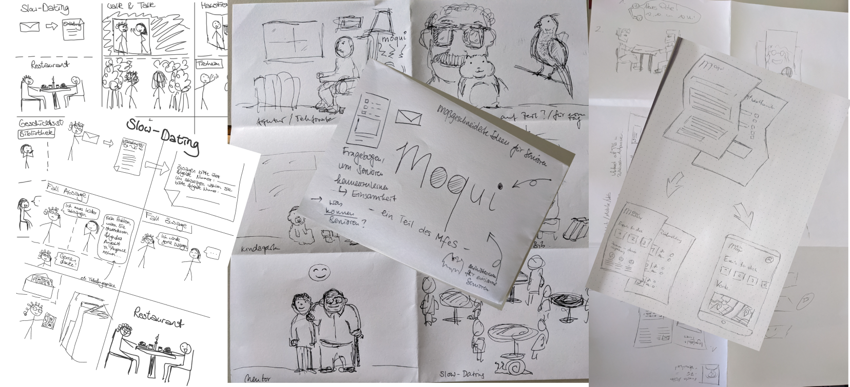
In the end, however, we had so many different ideas that we were unable to merge them. These were, for example:
❌ We got to the point where we didn't know what our MVP was going to be. So we took a short break and thought about how to get out of this situation. We noticed that we were not able to empathize enough with the elderly, so we decided to get more information through a survey - even though this is not intended in the Lean UX approach at this stage in the process.
We posted the survey in online forums targeting people over 60. We were interested in, for
instance, what technical devices the elderly own, what activities they engage in in their
everyday lives, and what they do when they feel lonely. We were also able to conduct a personal
interview with one elderly lady.
We were surprised at how tech-savvy the older people are: Most people own either a smartphone or
a laptop. The oldest person in our survey was 93 years old! Some of the people surveyed actually
stated that they often feel lonely. Reasons
included the death of a spouse, local seclusion to their family, or even illness.
The mentioned activities in everyday life were very diverse. One aspect, however, had caught our
attention: Many of the older persons stated that they would like to have more contact with
younger people, as they feel somewhat excluded from society.
To explore this aspect in more detail, we created another survey - but this time for younger
people. We wanted to find out if younger people are open to spending their time with (lonely)
older
people in our society. In addition, we wanted to know what obstacles exist to establishing
contact
with older people and what reasons could speak for and against the idea.
The majority of people surveyed were very receptive to spending their time with the elderly.
Based on this information, we decided not only to develop a solution that would connect
generations, on the one hand to combat the problems of loneliness and exclusion from society,
but also on
the other hand to give young people the opportunity to interact with older generations and learn
from their life
experiences!
💡 The two surveys were really a game changer for us. With Lean UX, the first contact with users actually happens after the MVP is created, which is based on assumptions. However, since we ourselves were not part of the target group of older people, it was particularly difficult for us to create a digital solution that would meet the needs of lonely, elderly people.
It was now necessary to adapt our personas and expand them to include young people. In the case of Helga Müller, we have added further details (in orange) that we were able to find out through the survey and the personal interview.


The second time we ran the Design Studio method, all three of us had the same idea: a platform where young and older people could sign up and connect with each other based on common interests. Now that we were sure what we wanted moqui to be, we could finally start creating our MVP.

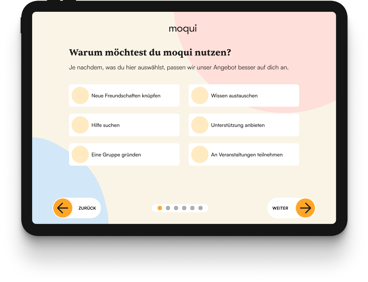
Landing page

Choose age
Our idea was to display a custom version of the registration
process tailored to the target audience, depending on which option was selected.

Sign up
It was important to us to keep the steps for creating a profile as
short as possible. The step display at the bottom should inform the user about the
current status. Navigation should be large and self-explanatory using the arrow
keys.

Select interests
By selecting interests and hobbies, matchmaking between young
and older person should take place later.

More details
In this step, further information about the person can be
entered. We thought long and hard about which information should be mandatory.

Data protection
It was important to us to give users control over which of
their data is visible to other moqui users.

Time preferences
The indication of the times when a person is available should
be used for a suitable matchmaking.

Loading spinner

Matching people
This screen shows the older people matched from a young
person's point of view based on interests and times.

Detail view
This is the detailed view via which it is also possible to contact
the person.
After our solution in form of a prototype was ready, we could finally start testing. The Lean UX approach includes weekly testings, which allows the MVP to be improved step by step through user feedback. In total, we were able to test our prototype with five people - both old and young. Below are some statements from the people interviewed:
"moqui reminds me of Bumble or Tinder. Because of the profiles and the possibility to search for other people. It's kind of awkward."
"Has similarities to a matchmaker."
"I would prefer to meet in the safe zone of a group, not in a dating exchange-style."
"It is not clear what advantage moqui offers. Information explaining moqui is missing at the beginning."
The feedback made us realize that we need to revise our idea again to avoid the impression of a dating agency. There were also some concerns about revealing contact details directly.
The revision of our MVP resulted in moqui 2.0. We shifted the focus of our new prototype away from individuals to groups. We paid attention to the following aspects:

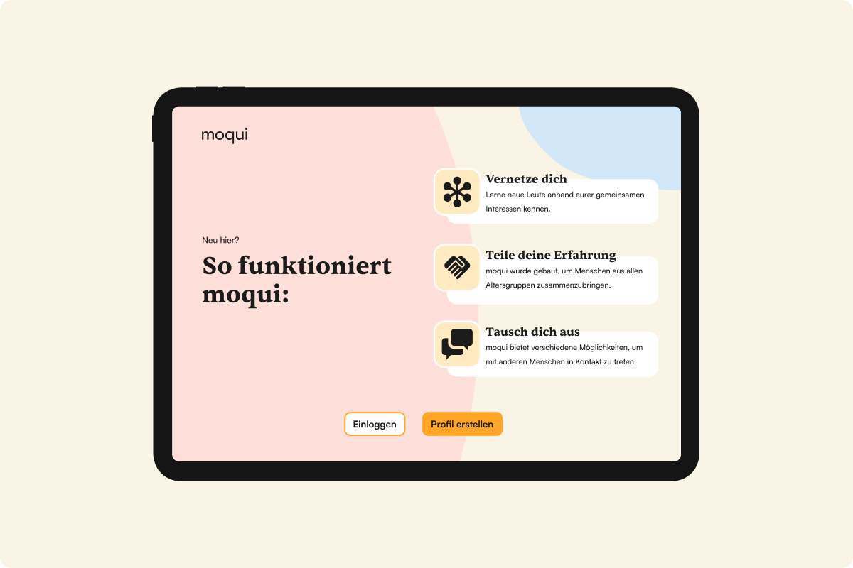
Improved landing page
One point of criticism was that it is not clear what
moqui
offers. In an improved version of the landing page, we wanted to present moqui's
features.

Sign Up
We discarded the idea of selecting age, since moqui 2.0 no longer
requires matchmaking.

Name and place
We organized the sign up process in small chunks.

Motivation
This selection should be visible later in a person's profile
and suggests, for example, groups or events, depending on the category, after the
registration process.

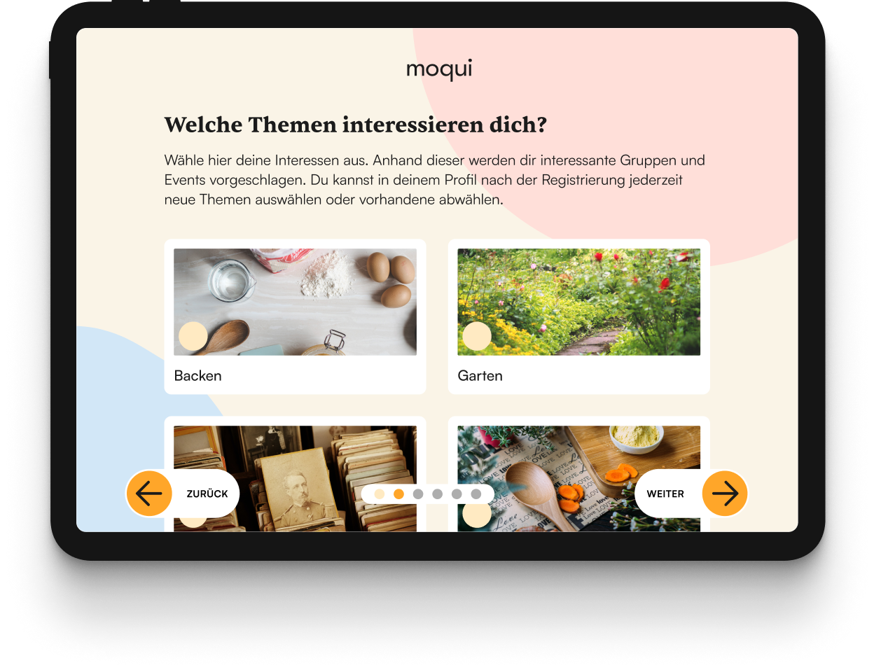
Interests
By selecting interests, suitable communities are later suggested.

Finish sign up
Here, final (voluntary) personal details are requested. We
considered rewarding a complete profile with a label so that users can be sure that
it is not a fake profile.

Loading spinner

Suggested groups
Based on the information provided, groups are suggested
directly after the registration process is completed. Data such as interests, the
place of residence and why one would like to use moqui form the basis for the
suggestions.

My groups
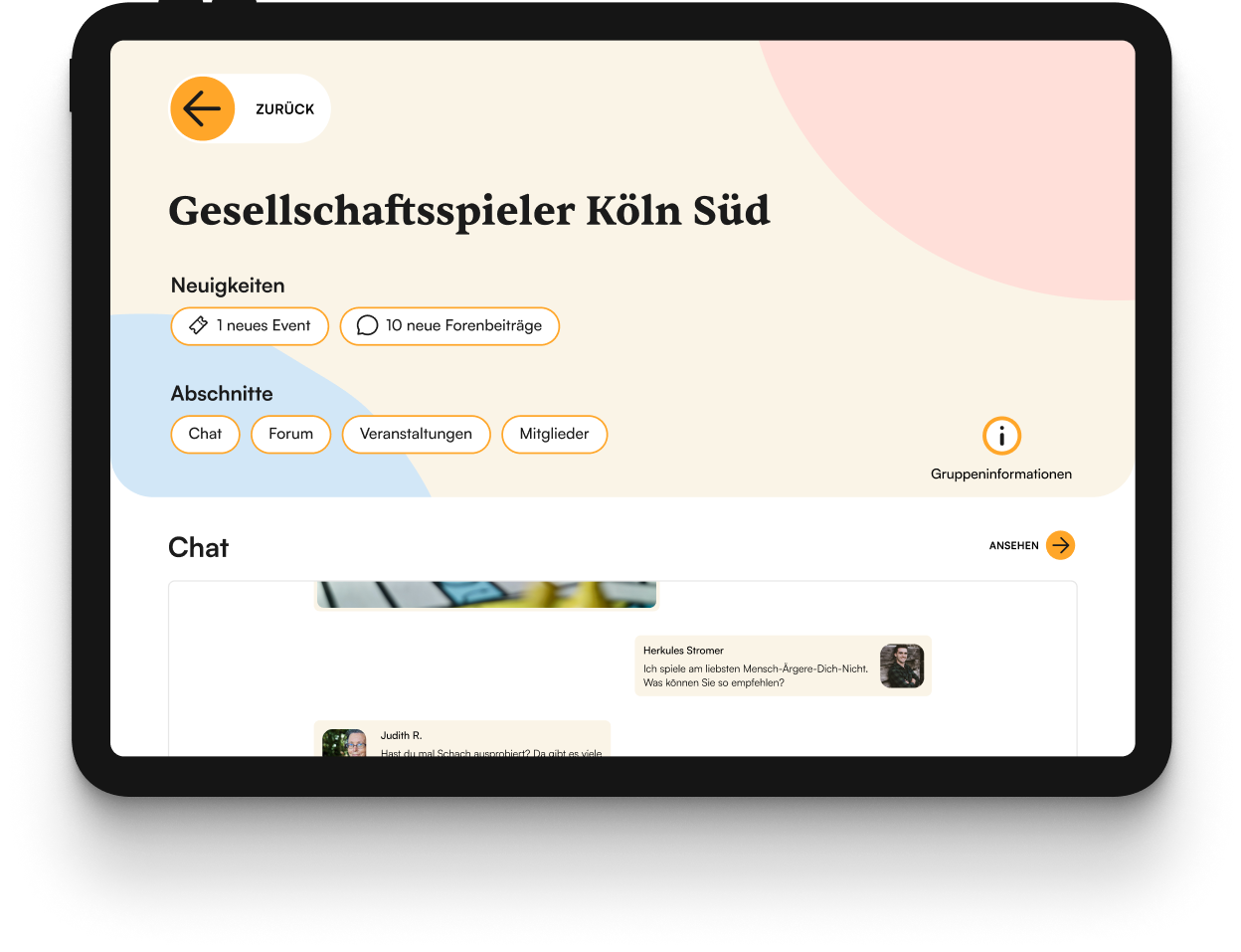
The Bottom Navbar allows users to navigate to the groups they have
already joined. Via tags the user is informed if there are
any news since the last login.

Calendar
The calendar displays upcoming events that users want to attend.

Detail group not joined
This is the view of a group that the user has not yet
joined. In the floating menu on the right side, the user will find a brief summary
of the group.

Detail group joined
After joining a group, the floating menu can be found in
the info icon in the upper right corner. Now the user can see news and sections
within the group.

Group internal event

Group internal event detail

Public events
In addition to internal group events, public events can also be
found that are not reserved for group members only.
💻 When we designed moqui 1.0, we had a website in mind because the older participants in our survey have either smartphones or laptops. However, we had received advice that older people might be able to use digital applications better with tablet computers due to the natural interaction with their hands. We tested this and indeed the elderly preferred the tablet PC compared to the laptop. Therefore, we decided to optimize moqui 2.0 for tablet devices.
We were able to test the second version of moqui with two people - one young and one older person. A few statements from the tests are shown below:
"When private individuals open a group, background information on the person is desirable. Otherwise it could be fake."
"moqui is a good idea. I see the solution especially for coming generations of older people."
"Organized by moqui / Privately organized labels are good thought, especially for seniors who may be a bit more cautious, or generally for people with security concerns."
Through the tests we could find out that we were on the right track with moqui 2.0 and we were able to improve our solution compared to the first version. This allowed us to focus on the design.
When determining the colors for moqui, it was important to us to be appealing to young and older people at the same time. Therefore, we selected color tones that should appear harmonious, somewhat reduced, but not boring.

As typography for moqui, we wanted to combine a serif font with a sans serif font to bridge the gap between classic and modern - as a metaphor for moqui, whose aim is to connect the generations. We chose Sentient for the headlines and Satoshi for the body text.

Our next step was to create a small design system in Figma, which allowed us to work consistently on our screens. We also had the idea to create shapes that looked like stones - as a reference to the moqui-marble stones.

Once we had defined our design language, we were able to start working on our final prototype.
Important points for the test persons that we included in our final prototype were a start screen explaining moqui, privacy settings for all personal information and an indication of the average age of a group.
Unlike the lo-fi prototype of moqui 2.0, we had again adopted the progress indicator present in moqui 1.0 into our final version. It was our goal not to overwhelm the user with too much information per screen.
Motivation
Interesting topics
The topic of data protection and not knowing what information is ultimately visible in the profile was a big issue, especially for the older people. Therefore, we integrated the setting of the visibility of the data right next to the input of the data.
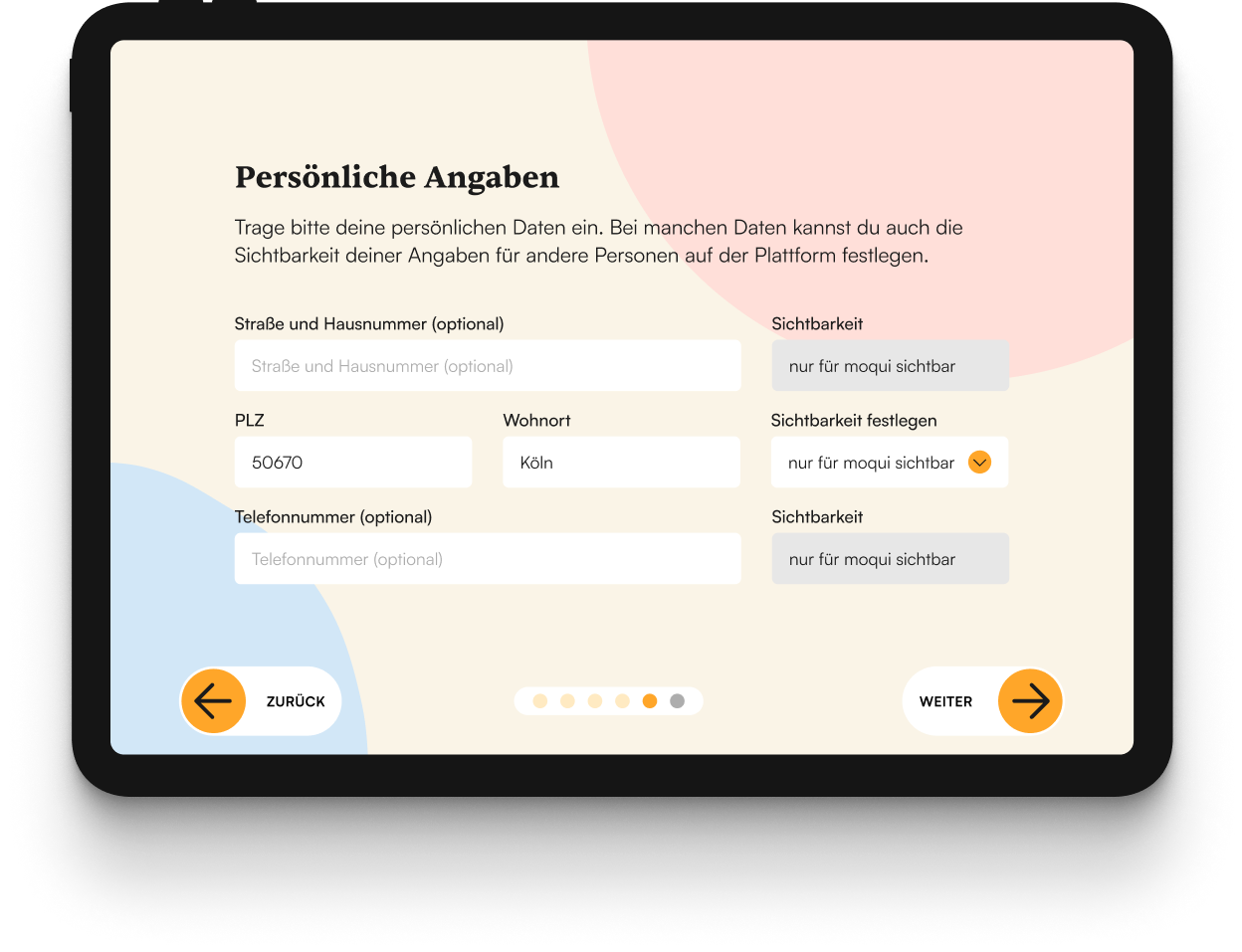
Personal data
Boxes with a gray background cannot be customized. For the other
privacy settings, you can choose between the options visible and only visible to moqui.
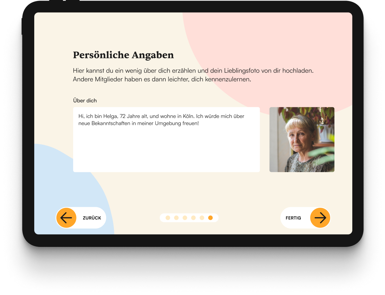
About you
In the previous version, the free text field "About you" was still in
the same screen as the rest of the personal data. However, since there was too much data
to enter, we put this in an extra step.
We took special care to ensure that all interactive elements were sufficiently large and that all texts were easy to read, so that older people in particular, who might suffer from motor difficulties or poor eyesight, would have no problems using the app. However, all users naturally benefit from accessibility.
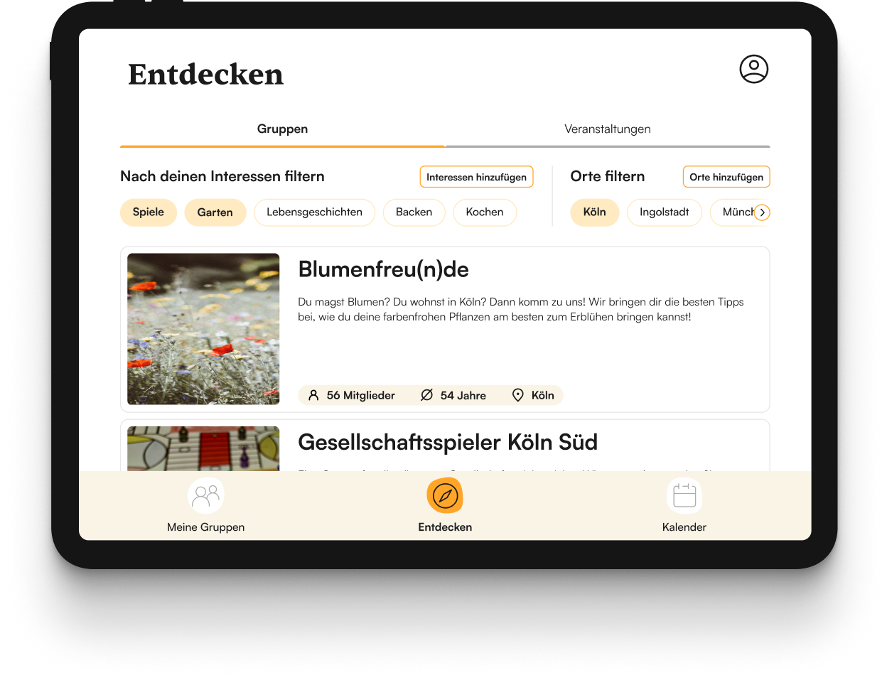
Discover
In the previous version, we didn't have a way to switch between events
and groups in the Discover section of the app. We solved this by putting both categories
in tabs.
Detail group joined
We also started to create an analog version of moqui. Our idea was to make contact forms available in places where older, lonely people spend time, such as a supermarket, a pharmacy or the waiting room of a doctor's office. By sending the completed form to moqui via mail, interested people can then be informed about events or pen pals.
😞 Unfortunately, at the end of the project we no longer had the opportunity to test our analog version for acceptance and usability. Overall, we had "lost" a lot of time due to the bumpy initial phase, in which we had difficulties defining a common idea of moqui, which meant that we were not able to conduct as many testing rounds as we would have liked.
It was a very interesting and educational experience to work on a project following the Lean UX
approach. I really liked the idea of creating
an MVP very quickly, which is shaped into a user-centric product over several weeks through
regular contact with the user groups.
However, we felt that we were missing a research phase, especially
in the beginning, where we could learn more about the requirements and needs of the
users. That's why we had done the surveys early on. We suspected that the Lean UX approach was
not necessarily the right approach given the complexity of our problem.
But what we came to appreciate was that Lean UX makes it possible to optimize a product very
quickly. At
some point, we only had individual screens evaluated in testings and not always the entire
application. This helped us a lot to create a digital prototype that we are very proud of in the
end.