Breathing through the nose can have positive effects on our health. The OMM app is designed to help people internalize nasal breathing. Daily routines can be introduced through reminders. This is a concept idea of mine that I may want to program one day.
Tools: Figma, miro, Notion
Time: ongoing
When I heard a few years ago via a podcast that many people breathe incorrectly, I was initially
confused. How can anyone not breathe correctly? Every day, a person takes about 23,000 breaths
- often inhaling and exhaling through the mouth. And that is not good for our health. The better
option: breathing through the nose. James
Nestor has dedicated an entire book to this topic. But
the exciting thing is that we can exercise proper breathing, which also brings some benefits.
There is the so-called 5.5
seconds rule: 5.5 seconds of inhalation followed by 5.5 seconds of
exhalation over several minutes can have a positive effect on our health. To implement this rule
in daily life, I had the idea to develop an app that helps with proper breathing.
Important points for me were the fast and uncomplicated operation of the app. Since breathing can also help in stressful situations to come down a bit, it was crucial for me that the interface should not have too many features and that the main function, starting a breathing session, should be the focus.

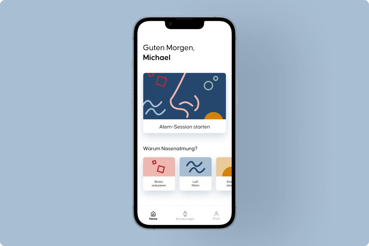
Homescreen
The Start Breathing Session button takes the user directly to the main
feature.

Set duration
Before the session starts, it is necessary to choose for how long the
breathing exercise should take place. This can also be set individually.

Countdown
After a short countdown, the inhalation starts.

Inhalation
The circle fills within approx. 5 seconds. As soon as it is fully
filled, the exhalation begins for 5 seconds. This is repeated.
I tested the wireframes with a few people and it was amazing to hear different ideas mentioned
for the inhale and exhale animation. The app flow was clear and easy to use due to the fact that
the prototype consists of only one feature.
However, I also received feedback that an explanation of what benefits nasal breathing is
desired. I took this into account in the next iteration of the prototype.
I identified four benefits of nasal breathing, which is why I chose the four colors red, blue, yellow and green. For each category I designed geometric shapes. The app itself is very minimalistic and uses a lot of white space to convey a calming effect.

Based on the test feedback, next to the start of the breathing session, I also added a section presenting some of the benefits of nasal breathing.

The individual categories explaining the benefits of nasal breathing can be swiped and selected. The article can be closed via the X in the top right corner.
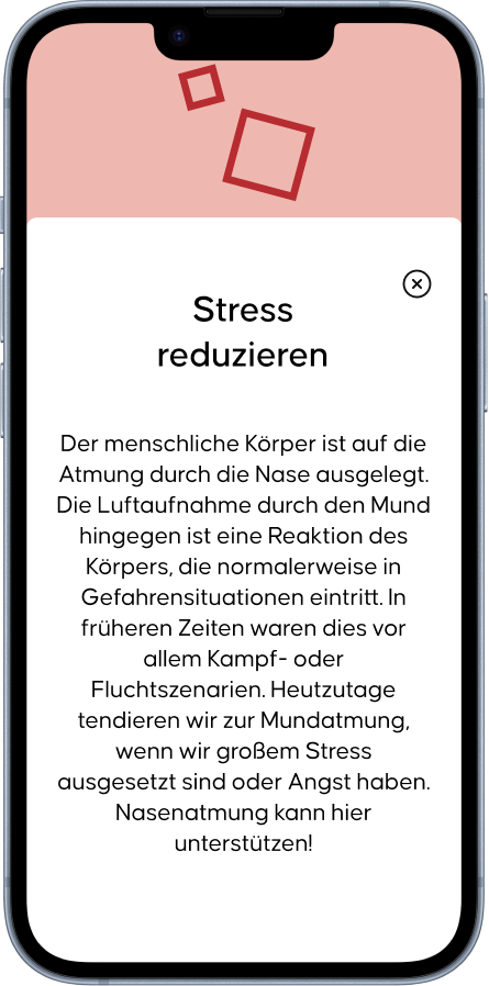
Reduce stress
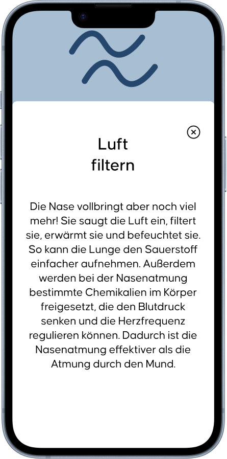
Filter air
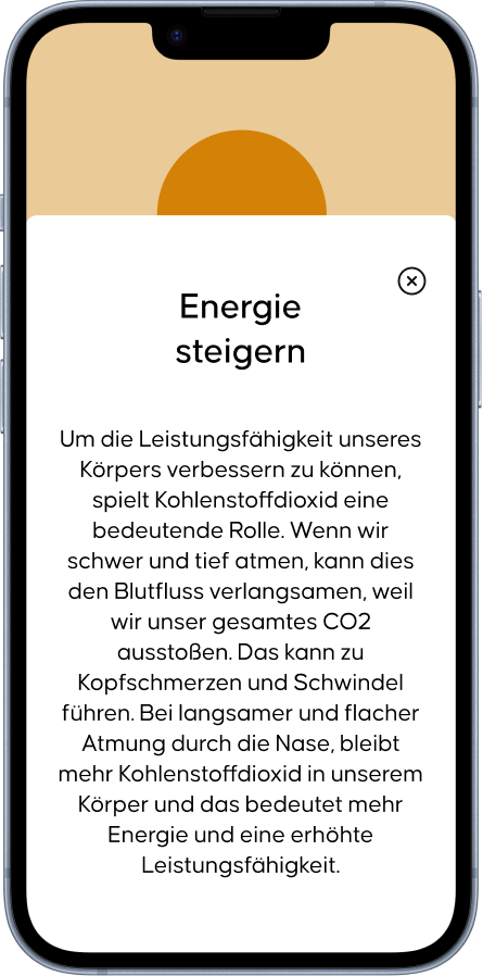
Increase energy
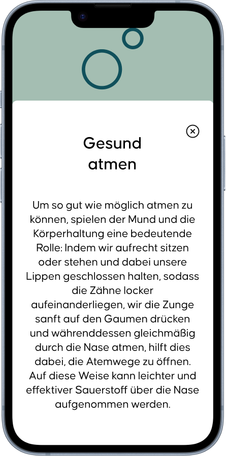
Breathe healthy
Compared to the concept already shown above, little has changed except for the addition of the categories. When the session starts after the countdown, the breath action is first displayed in large letters.
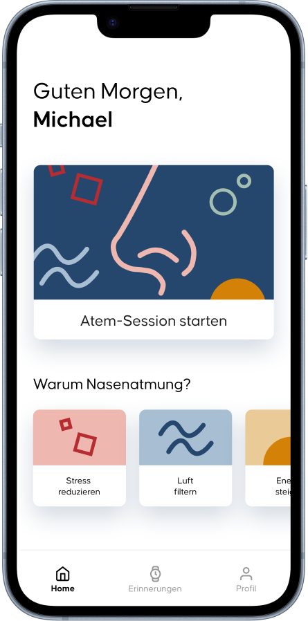
Homescreen
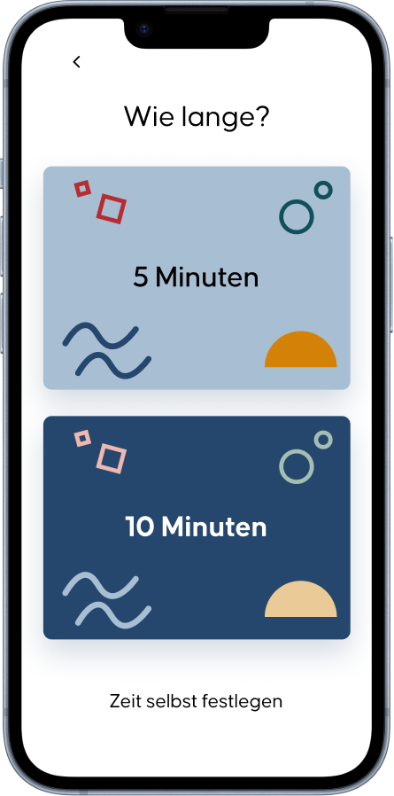
Set time
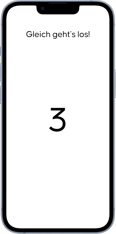
Countdown starts
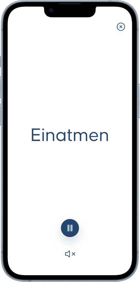
First inhalation
During the breathing session, the user can pause the session at any time or close it via the X. One consideration I had was also to inform the user about the breathing action via a sound, so that the app can be used even when the display is off - for example, via headphones in a public place.
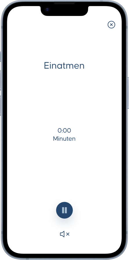
Inhalation screen
After the countdown is over, the breath action is displayed
large in the middle of the screen. The screen then changes to this representation via an
animation.
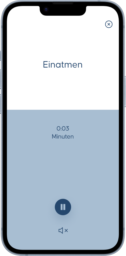
Inhalation animation
As an animation that visually supports the inhale action,
I considered using a bar that fills up from the bottom of the screen to the top within
the 5.5 seconds.
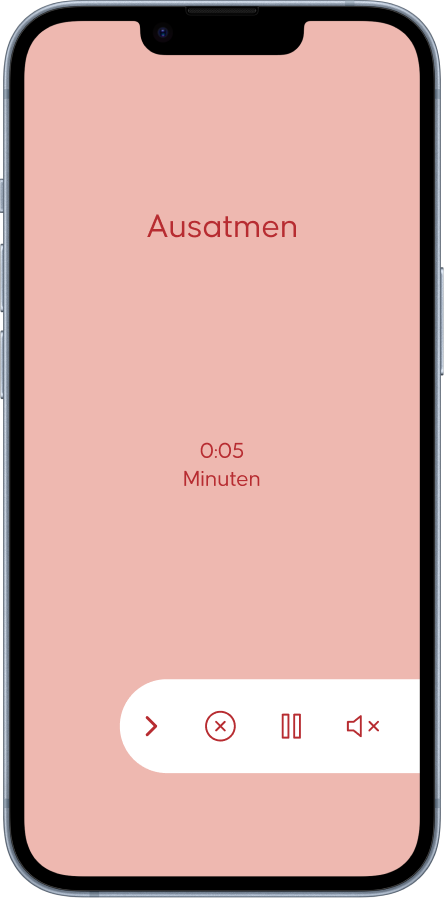
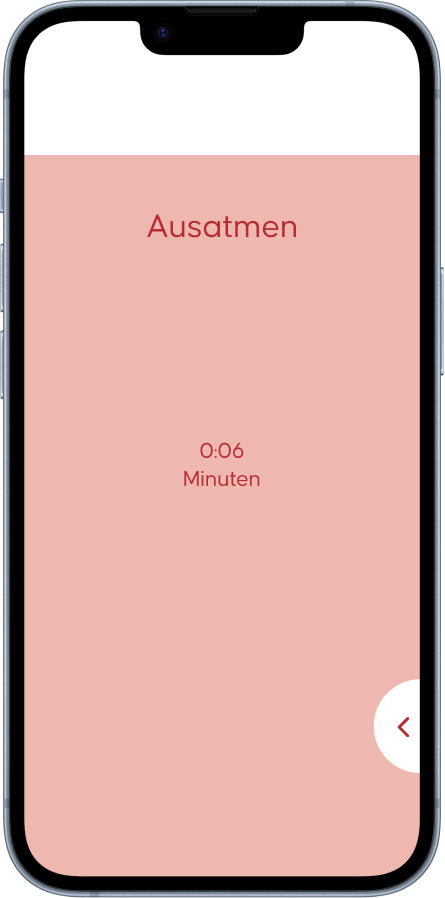
Alternative controls
After one breathing action is completed, the color changes
to one of the four
colors of the app. I thought about alternatively placing the actions within a small menu
to put the full focus of the users on the breathing and the time.
Alternative controls folded
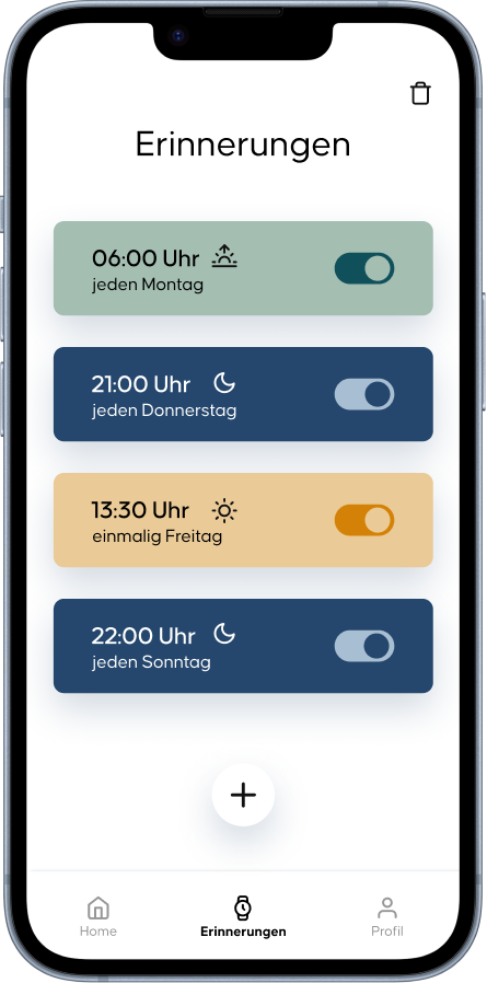
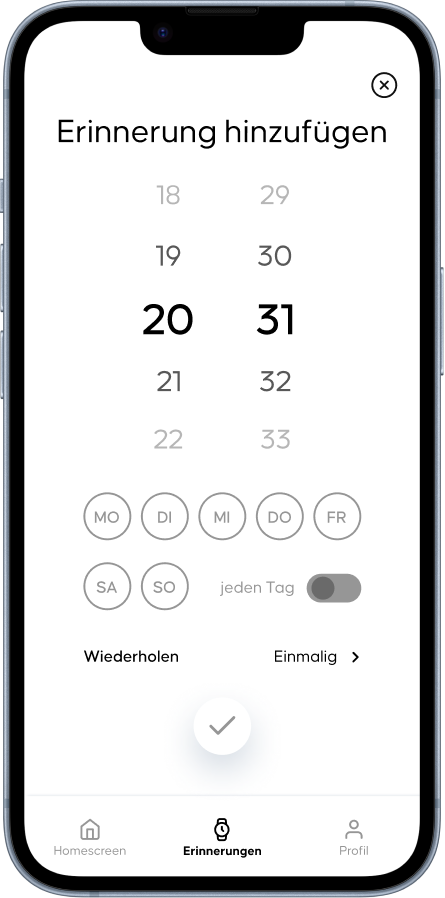
The final feature of this app is the ability to set reminders for breathing sessions. This interface is based on well-known alarm clock interfaces.
Reminder function
Based on the specified time of day, the set reminder takes on
a hue: Green for morning, Yellow for noon, Blue for evening.
Set reminder
Set reminder: background color blue
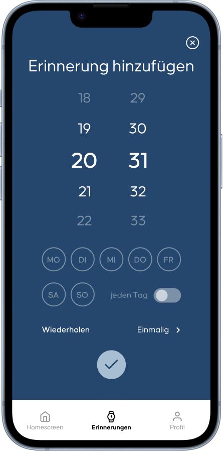
Also, an idea of mine that is yet to be
tested was to display the background color of the reminder panel directly when setting
the preferences.
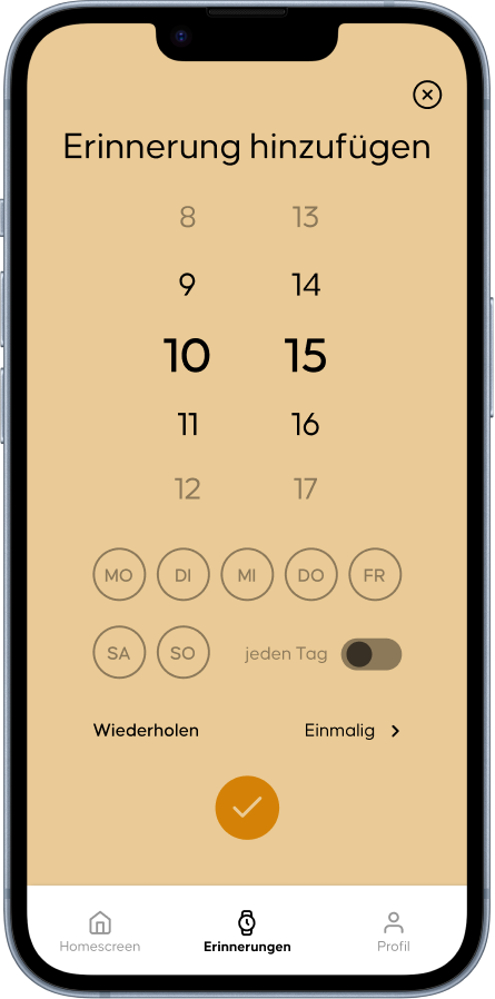
Set reminder: background color yellow
There are some features and interfaces I want to test: First of all the animation during the
breathing session. I'm particularly interested in how quickly the bar appears, whether the
change in color causes a stir, and which control option (all functions visible vs. menu) is more
user-friendly.
Likewise, I want to know if the bar animation is a good representation or if the filling circle
from the first concept rendering is a more useful alternative.
I also want to find out if the colors when setting the reminder are a good idea or just a
gimmick.